
Why do my students love the

so much?
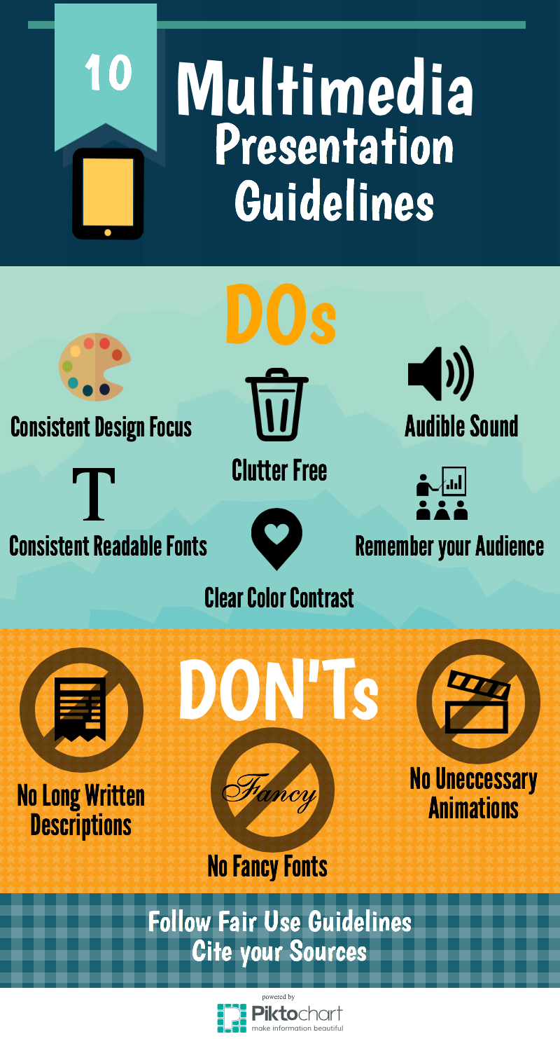
I'll tell ya why, it's the same reason they love to have a million different types of font in their multimedia presentations.
They want to drive me insane.
Oh, and it's not just the kids who love the Fancy Font. Full grown adults like to snaz up their .ppts with them too, maybe even with several different variations for our viewing pleasure.
It's an absolute crime that Powerpoint allows for words to drop from the PowerPoint heavens, one letter at time, in Edwardian Script ITC. A crime against teacher sanity.
Ridiculous. How is it in 2015, training professionals are still creating animated PowerPoint presentations with mind numbing animations? I'm going to reach a bit and claim that we, as a sophisticated group of teachers, are no longer impressed with the Fancy Font or the animated clip art from the Microsoft Gallery. It's painful to watch and stop making us do it!
Therefore, we have the NO FANCY FONT rule in my classroom. As a result, I am attempting to establish a set of guidelines to help my students create multimedia products that are effective AND aesthetically appealing. Not just fancy.
I created this infographic at piktochart.com (for free) to hopefully help give my class some guidelines for classroom multimedia presentations that aren't cluttered with ridiculous fonts, clip art or animations.
I tirelessly combed the internet for a definitive source on providing students with guidelines for multimedia presentations. But in the end, I had to do it myself. Like most things.
I just had to "Git 'er done," as we sophisticates like to say.
I tirelessly combed the internet for a definitive source on providing students with guidelines for multimedia presentations. But in the end, I had to do it myself. Like most things.
I just had to "Git 'er done," as we sophisticates like to say.
IMS Bove
No comments:
Post a Comment